
Week 2: HTML/CSS Pt. 2-UX/UI Design
“Genius is 1% inspiration, 99% perspiration.”
-Thomas Jefferson
Week 2 | Overview
- Intro to CSS
- Commenting your Code
- Color
- Fonts
- Meta Data
- What is CSS
- Basic CSS Tutorial
- CSS Box Model
- CSS Syntax
- Classes and IDs
- Three ways to use style sheets
- Manipulating Basic CSS Properties
- UX Design
- UI Design
- Web/Mobile/App Design Process
- Site Map
- Wireframes
- Styleframes
- Review on Sizing Images for the Web and Mobile
- HTML Review Quiz
- In-class Assignment
COMMENTING YOUR CODE
You can place a comment tag in your HTML to put a note into the code that will not be rendered by the browser. This is especially handy in a long and complex page. A comment is formatted as follows:
<!-- This is a comment -->
Everything between the <!– and –> tags will be hidden from the browser, but visible when you view the source.
COLOR
All color in Web pages, whether it is in text, background color, or other interface elements, is expressed in the HTML via hexidecimal codes. These codes consist of a # followed by 6 letters and numbers. For example, the code for white is #FFFFFF.
Below are two excellent references for the hex codes for the Web-safe palette.The Web-safe palette is a collection of colors that have been determined to be consistently rendered across boundaries.
Webmonkey Color Code Chart
Visibone Webmaster’s Palette
FONTS
Because a Web browser can only utilize those fonts installed on the end-user’s machine, there are a limited number of fonts reliably available across platforms. Here’s an up-to-date list of them:
You should only use these fonts, or generic font designations, in your style sheets.
Here is a great resource for viewing how Web fonts will look in a browswer:
META DATA
Meta data is located within the <head> of a web page. Your meta data is basically information that you insert that explains what this page/site is all about. Copy and past the code text below into your head:
- Keywords:
Information inside a meta element describes the document’s keywords.
The Code Looks Like this:
<meta name="keywords" content="HTML, DHTML, CSS, XML, XHTML, JavaScript, VBScript"> - Description:
Information inside a meta element describes the document.
The Code Looks Like this:
<meta name="description" content="Free Web tutorials on HTML, CSS, XML, and XHTML"/>
WHAT IS CSS?
- Cascading Style Sheets (CSS) are a standard developed to allow designers control over presentational elements of a Web page and effectively separate content from presentation.
- A style is a group of attributes that are called by a single name.
- A style sheet is a group of styles.
- The cascade part of CSS means that more than one stylesheet can be attached to a document, and all of them can influence the presentation. It also means that different applications of CSS can be applied to a page in order of precedence: inline, embedded, external and default.
Basic CSS Tutorial
THE CSS BOX MODEL, TYPES OF ELEMENTS

The three types of HTML elements to apply styles to:
An important concept to understand is that there are basically three types of HTML tags: block-level elements, inline elements, and replaced tags.
- Think of block-level elements as boxes that have a line break before and after. Block-level elements are the ones you will spend most of your time applying style rules to, or manipulating with scripting. They include
h1-h6, p, div, ul, ol, blockquote.
- Inline elements
- on the other hand, don’t have line breaks before and after. Inline elements are used in the middle of another element, and include
a, b, strong, italic, em, span - The third kind of HTML tag is called a replaced tag. What it means is simply that these elements have a set width and height. The most-used replaced tag is the <img> tag, which you must specify a height and width for.
If an element is not explicitly defined, it is known as an anonymous element.You will not be able to style this element directly.
CSS SYNTAX
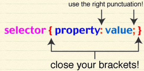
The CSS syntax is a little different from the tag and attribute format of HTML. A CSS style is made up of a selector, which is the HTML element or class name you wish to define rules for, and a set of properties and values. A property and its value are separated by a colon (:). You can define multiple properties for a style, separating them with a semi-colon(;). Property/value sets are enclosed in brackets{}.
For example, if you wanted to redefine all HTML in your <p> tags to look like this, then your style would look like this:
p {

color: #00CC00;

font-size: 13px;

font-family: "Courier New", Courier, monospace;

font-weight: bold; text-decoration:none;

}
The order of properties doesn’t matter, as long as you separate them with a semi-colon. Property values that have multiple words are surrounded by double quotes: “Courier New”.
You can apply the same style to multiple selectors by grouping them:
h1, h2, h3, h4 {
color: #00CC00
}
There is a full CSS reference and extensive code examples at:
also at: http://www.barelyfitz.com/screencast/html-training/css/positioning/
Sizing in CSS
There are a number of different measurement schemas within xHTML / CSS. Which one to use depends on context, and you can mix and match them.
px– number of pixels, relative to the screen size. This is the most consistent across machines, browsers, monitors%– percentage of the total width or heightem– size relative to the em size of the base font
We will go into when it is appropriate to use the various schemes in later weeks. For now, use the px units in your stylesheets.
CLASSES AND IDS
Classes and Ids are a way to designate specific elements in your HTML. You can apply either a class or id or both to any element:
<div id="navigation">
<p>
There is one key difference between a classes and ids:
- IDs can only be applied to one element per page
- Classes can be applied to multiple elements per page
When naming classes and ids, it is good practice to name them logically and semantically. The names should not describe the physical attributes of the style you plan to apply to them, but the type of thing that they are in the structure of your page. For example, if you have a unordered list of links that will serve as your navigation, this:
<ul id = "navigation">
is better than this:
<ul id = "top">
The reason for this once again we want to separate the structure from the presentation. Naming your classes and ids logically means that if you radically change the color scheme or layout defined by your style sheet, the structure will still make sense.
CREATING AND LINKING TO YOUR OWN EXTERNAL STYLE SHEET
An external style sheet is a plain text document containing all the style declarations you wish to apply to the linked pages. It does not have the structural tags (html, head, body) that your HTML documents have.
Once you have created your style sheet, you can associate it with your page using the link tag in your HTML, placed between the <head> tags:
<link href="my_style_sheet.css" rel="stylesheet" type="text/css"/>
3 WAYS TO USE STYLE SHEETS
There are three methods of accessing style sheets from your HTML:
- Inline as part of an HTML tag.
- Embedded in the <head> section of your page between <style></style> tags
- In an external document that is linked to the page
Here is an example of a page that uses inline and embedded styles:
We are going to focus primarily on using external style sheets. The are a couple of advantages to this. First, you can apply the same styles to some or all pages of your site. Second, you can make a change on the external style sheet and all the pages it is linked to will change. And last, with a simple change to your code, you can switch style sheets and completely alter the look of your page.
Style sheets work in 4.x or later browsers (but still not consistently) such as Navigator 4.5 or 6 and IE 4 or 5. Most earlier browsers ignore them.
A good place to see style sheets in action, and to really understand how powerful they are, is the CSS Zen Garden.
MANIPULATING BASIC CSS PROPERTIES
BASIC CSS REVIEW AND CSS PART II:
RULES AND SELECTORS
To style elements in a document, you apply rules to selectors. A “selector” is a way of referring to some specific element or group of elements on a page. If you want to apply a style to all paragraphs, then the <p> (paragraph) tag is our “selector” – it’s what we’re “selecting” to style. Selectors can either be standard HTML tags, or custom elements you define.
A “rule” is a set of properties that get applied to the selected element or elements. A rule can be as simple as a single line declaring the background color of the element, or a complex grouping of properties that work together to achieve an effect.
Let’s walk through styling a single paragraph. First, attach a style to an element on the page, and create rules as name:value pairs, separated by semi-colons. (You’re writing this all in your HTML page)

This single paragraph, the paragraph that you applied the color “red” to, will look different from every other paragraph on the page. The text will be red.
Lorem ipsum dolor sit amet, consectetur adipisicing elit, sed do eiusmod tempor incididunt ut labore et dolore magna aliqua. Ut enim ad minim veniam, quis nostrud exercitation ullamco laboris nisi ut aliquip ex ea commodo …
Now, delete the “<p style=”color:red;> from your HTML page. Go into Text Wrangler and create a new page and call it style.css. This will be your EXTERNAL stylesheet. See the image below.
In the new style.css document you’ve created, write in the following:
p {
color:red; }Note: You must put this link inside the header tags. <link rel=”stylesheet” type=”text/css” href=”style.css” /> You can add as many rules as you want. See a few more below:
p {
color:black; font-size:12px; font-family:Verdana; }NO style tags are to be used inside your HTML document. Everything will be placed in an external stylesheet called style.css.
CUSTOM SELECTORS
In the example above, every <p> tag will have ALL the attributes you list. This is a page-wide rule that is applied to all paragraphs on the page. That’s fine in some circumstances but what if you want to apply a specific attribute to a specific paragraph? CSS uses the “class” and “id” constructs to make this very eacy. By attaching a “class” name to an HTML element, and writing a corresponding rule for that class, you can get as specific as you like. Go back to the style rules above and modify them to look like this:
p {
color:red;
font-size:10px;
font-family:Arial;
}
.mango {
color:blue;
background-color:gold;
border:3px solid black;
padding 15px;
}
Now, modify the opening <p> tag of your paragraphs to look like this:
| 1 | <p class="mango">Lorem ipsum ... </p> |
That specific single paragraph on your page will have the additional stylistic information taken from the style.css doc from .alert. That specific paragraph will now have the font color: red, font-size:10px, font-family:arial and everything listed under .alert. If you add <p> to another <p> tag on your page, that <p> tag will also have the same attributes. If you want another <p> on the page to have different and specifics attributes, simply name it something different. Example: <p> and write the specific .monkey attributes in your style.css page.
CLASS VS. ID
There are two constructs for custom selectors — “class” and “id.” Class can be applied as many times as you like on a page. IDs work almost the same way, but apply to just one element on a page. When creating rules for IDs, simply prepend the selector name with “#” rather than “.” Example:
#footer {
color:#ff0000;
background-color:red;
border:2px solid black;
padding:20px;
}
Since you will probably only ever have one footer on a page, it makes sense to use this as an ID rather than as a class. You would invoke this ruleset in your document like this:
| 1 |
<p id="footer">Lorem ipsum dolor sit ... irure dolor in reprehenderit in </p> |
REFINING SELECTORS
Above we created rules that apply either to a single HTML tag, or to anything that matches a custom selector name. But we have a lot more control than that. You can broaden or narrow the “scope” of elements your rulesets apply to.
p, ol, ul, dd, blockquote {
color:#00ff00;
font-size:14px;
font-family:Verdana;
}
Now the rules in the set will apply equally to paragraphs, ordered, unordered and definition lists, and to blockquotes. If you want to set basic rules that will apply to your entire document, there’s an easier way — just use the <body> tag as your selector:
body {
color:#00ff00;
font-size:14px;
font-family:Verdana;
}
Since all visible elements in a document (elements that show up on your website) fall inside the opening and closing <body> tags, the rules above will apply to everything on the page. CSS favors the specific over the general so you can easily override any rule on a per-selector basis. For example:
body {
color:#000000;
font-size:14px;
font-family:Verdana;
}
blockquote {
color:#ffffff;}
Even though you’ve defined a color for the entire document within you <body> tage, and your block quotes fall inside that document, blockquotes will be rendered with a white font (#ffffff stands for white). The cascade says that even though everything on the page is black by default (you listed that in the <body> tag), blockquotes are treated like an exception.
Narrowing the Scope of Rulesets
We can also create the opposite situation. Above, I showed you the class .mango, which applied to anything on the page with class="mango". What if you want to be more specific than that or if you only want those rules to apply to paragraphs in that specific class, but not to blockquotes in that class. This is done like this:
p.mango {
color:darkred;
background-color:blue;
border:2px solid black;
padding:10px;
}
The rule above would not be invoked for standard paragraphs, nor would it be invoked for blockquotes with a class of “mango.” It would only be invoked for paragraphs with a class of “mango.” This “narrowing” approach can be used for IDs as well as classes:
p#mango {
color:darkred;
background-color:blue;
border:2px solid black;
padding:10px;
}
The rule above would not be invoked for standard paragraphs, nor would it be invoked for blockquotes with a class of “mango.” It would only be invoked for paragraphs with a class of “mango”. This “narrowing” approach can be used for IDs as well as classes:
p#mango{
color:darkred;
background-color:bisque;
border:2px solid gray;
padding:10px;
}
FONTS AND TEXT
You can set the font face (font-family), the font size, font style (such as italic) and the font weight (such as bold):
p {
font-family:”Arial”,Verdana;Georgia,Serif;
font-size:10pt;
font-weight:bold;
font-style:underline;
}
Font sizes can be set in pixels, points, ems, or relative values.
From within CSS you can control how wide your letters and lines are spaced, set your text color, align text right, left or center, and even change the case of text.
Setting text color and letter spacing:
Letter spacing can be set in points, pixels, or ems. “Em” is a typesetter’s term, referring to the width of one character. It is recommend to use ems when setting text sizes and widths, because it flexes automatically with the user’s current screen resolution and magnification.
Line spacing is not set in ems – it’s a simple decimal value representing a factor of the current line height. In the example below, “1.8″ means “spacing between lines should be 1.8 times whatever the current height of a line of text is.”
p {
color:#166A3F;
font-weight:bold;
letter-spacing: 0.3em;
line-height: 1.8;
}
If you wanted to make the text uppercase, just add the following line : text-transform: uppercase; If you wanted to change the text alignment, just add the following line: text-align: center|left|right; (You would need to choose either center, left or right). You could also add: text-align:justify; if you wanted the text to justify into a block.
BORDERS
You can put a border around almost anything on your page including a single character, an image or a section of a page. Borders can be of any thickness, any color, and can be solid, dotted, or dashed. If you use border: by itself, the border will go around all four sides of the element. Or you can use border-top:, border-left: and so on to control each side of the border independently. You can can consolidate all of the attributes of the border into a single command by separating the attributes with spaces.
Example:
p {
border:1px solid #4c97ff;
}
By not specifying a side, you get the same 1px consistent border on all four sides of an element. If you want to control each specific side of a border, use: (change the colors to what ever you like)
p {
border-top:3px solid #595128;
border-right:5px solid #3d3600;
border-left:2px dotted #5bbe00;
border-bottom:5px dashed #005062;
}
Using four different colors on a border would be pretty ugly so try his. A 1px border around a paragraph would look like this:

BACKGROUNDS
You can set the background of any element with your choice of either a solid color or a tiled (repeating) image.
Example:
p {
background-color:#00ff00;
}
If you want to use a tiled image as a background, just specify its relative or absolute URL:
p {
background-image: url(‘http://a3.twimg.com/profile_images/454374541/iTunesU_Button.jpg’)
}

By default, a background image will tile repeatedly in all directions, to fill up the space it’s assigned to. You can tell your background image to only repeat along the x or y axis. In the next example, we use both a background color and a background image. We tell the background image to only repeat vertically. To prevent the text from sitting on top of the tiled image, we add 120px of left padding.
p {
background-image: url(‘http://a3.twimg.com/profile_images/454374541/iTunesU_Button.jpg’);
background-repeat: repeat-y;
background-color:#D33333;
padding:10px;
padding-left:120px;
border:1px solid #899999;
}

MARGINS AND PADDING
Margins refer to the area around, or outside of an element. Padding, refers to the area between the edges of a box and what lives inside that box. An easy way to remember which is which is to think of mailing a breakable object – you fill the empty space in the box with foam peanuts to protect the item. Those foam peanuts are your padding. The margin would then be the space between your box and the next box in the truck. Just remember: Padding is inside the box, margins are outside the box.
In CSS, you’ll use padding to give an element some breathing room within the space it’s in, as we did with the last example in the Backgrounds section. You typically use margins to cause a box or element to be offset from adjacent elements. The syntax for working with padding and margins is very similar.
Padding and margins may just seem decorative right now, but they’ll become critical when we start getting into CSS page layout, so make sure you understand them.
Example:
p {
padding:25px;
border:4px solid blue;
}
Would give you below:
Just like borders, padding can be controlled for the whole box, as above, or per-side:
p {
padding-top:0px;
padding-right:25px;
padding-bottom:45px;
padding-left:15px;
border:4px solid blue;
}
When setting padding values separately for different sides of a box, you can use this shorthand, which achieves exactly the same result as the previous example:
p {
padding:0px 25px 45px 15px;
border:4px solid blue;
}
MARGINS
To illustrate how margins work, I’ll show you how one element (box) relates to another. For this example, we’ll be putting a sample paragraph inside of an element called a “div”. A div is an arbitrary box used to contain other things. I’ll put a border on the div so you can see it, then put a paragraph with its own border inside that div, so you can see what the margin attributes do to it.
div {
padding:0px;
margin:0px;
border:1px solid blue;
background-color:#AFEEBD;
}
p {
padding:10px;
margin:10px;
border:1px solid blue;
background-color:#ACCFDB;
}
The blue space above represents the paragraph, while the green space represents the margin between that paragraph and it’s containing box. As with padding, we can control margin depths per-side, rather than globally.
LISTS AND CSS
An ordered or unordered list can be much more than a simple set of bullet points – in CSS, lists are often used to create navigation elements such as horizontal or vertical menus. Let’s start with options for simple lists.
For unordered lists, you can select whether the bullet style should be circular, square, or none:
ul {
list-style-type: square;
}
apple
Is a
List
Try changing “square” to “circle” or “disc” for other effects. You can also use an image in place of your bullets by specifying its URL:
ul {
list-style-image: url(http://www.w3schools.com/css/arrow.gif);
}
This
Is a
List
Ordered lists can have any combination of Roman numerals, decimal, alphabetic characters and more. A nice trick is to nest lists within lists, then use the CSS nested selector syntax we learned earlier to style different levels of your list differently, like this:
ol {
list-style-type: upper-roman;
}
ol ol {
list-style-type: decimal;
}
ol ol ol {
list-style-type: lower-alpha;
}
Person
Place
Region
Country
United States
Canada
Mexico
State
Thing
In the example here, ordered lists “ol” are told to use “upper-roman” as the list-style-type, unless it’s an ordered list inside of an ordered list, in which case the list-style-type is “decimal”… unless it’s a triply nested ordered list, in which case the list-style-type is “lower-alpha.” This technique is the key to building CSS based flyout navigation menus.
LISTS AS MENUS IN CSS
By default, list items are “block-level elements,” which means each one gets a line break above and below itself. To make a list appear horizontally, we need to override the default block behavior and use CSS to tell list items that they’re “inline” elements instead. In this example, we’ve also added background-color and padding to our list items, to make them appear like real menu items. Here is the simple HTML and CSS to create a basic list menu.
li {
display: inline;
list-style-type: none;
background-color:#425899;
color:white;
padding:5px;
}
<ul>
<li>Item one</li>
<li>Item two</li>
<li>Item three</li>
<li>Item four</li>
<li>Item five</li>
</ul>
Which seen by the browser it looks like this:
To make the experience more intuitive, we want to add some rollover behavior, so that the list items change color when the mouse rolls over them. To accomplish this, we’ll first make our list items into links (in the HTML). Then we’ll again use the CSS nested selector syntax to detect a linked item inside of a list item. Finally, we’ll use the anchor tag’s :hover pseudo-property to change appearance when a list item is in a certain state – namely, when the mouse is hovering over it.
li {
display: inline;
list-style-type: none;
}
li a {
background-color: #60996C;
color:white;
padding:5px;
text-decoration:none;
}
li a:hover {
/* This rule is only in effect when mouse is hovering */
background-color: #567499;
}
<ul>
<li><a href=”#”>Item one</a></li>
<li><a href=”#”>Item two</a></li>
<li><a href=”#”>Item three</a></li>
<li><a href=”#”>Item four</a></li>
<li><a href=”#”>Item five</a></li>
</ul>
See below. Roll mouse over list items to see the hover state in effect.
Simplicity
Simplicity is the new trend in user experience design. Maybe users don’t really need as much information on their screens as they think they do. Presenting information so it doesn’t look complicated is key to the user experience. The amount of information we must present is only going to increase. But, as designers, we can determine what is truly important to display and how to display it. We have the opportunity to shape the way people interact with and information is disseminated. The key is to ensure that we are designing to deliver good user experiences, not allowing our designs to be shaped by them.
User Experience (UX) Design
Two main components for app design: User Experience (UX) Design and User Interface (UI) Design focuses on the goals of the app including which features to include and how the user will accomplish those goals. UX encompasses all aspects of a person’s experience with the system including:
- interface
- graphics
- industrial design
- physical interaction
- manual
UX focuses on user-centered design practices to generate cohesive, predictive and desirable designs based on holistic consideration of users’ experience. User Experience design encompasses traditional Human-Computer Interaction (HCI) design and extends it to include all aspects of a product as perceived by users.
RESOURCE:
UX Strategy and Planning group on LinkedIn
- ‘Design Is a Process, Not a Methodology,’ by Pabini Gabriel-Petit
- ‘Great User Experiences Require Great Front-End Development,’ by Jim Nieters, Amit Pande, and Uday M. Shankar
- ‘Integrating UX into Agile Development,’ an Ask UXmatters column, by Janet M. Six
- ‘7 Ingredients of a Successful UX Strategy,’ by Paul Bryan
- ‘Audience Segmentation Models,’ by Steve Baty
- ‘Sharing Ownership of UX,’ by Pabini Gabriel-Petit
- ‘Selling UX,’ by By Daniel Szuc, Paul J. Sherman, and John S. Rhodes
- ‘Communicating Customer and Business Value with a Value Matrix,’ by Richard F. Cecil
- ‘UX Roles in Organizations,’ part of an Ask UXmatters column, by Janet M. Six
- ‘Design Thinking,’ part of an Ask UXmatters column, by Janet M. Six
- ‘Strategy06: A UX Professional’s Experience of the Conference,’ by Pabini Gabriel-Petit
- ‘The Rise of Cross-Channel UX Design,’ by Tyler Tate
- ‘What Does a UX Strategist Do?’ by Paul Bryan”
UX Design Trends
Responsive Web Design: Responsive Web design lets designers deliver optimal user experiences for a range of specific devices, different screen resolutions, browser viewport sizes, and display information that is appropriate to different devices, contexts, and states. Example: Computer screen, tablet/iPad and mobile solutions. The key is that the designer can tailor UX designs to specific devices, while at the same time achieving scale. Responsive web design enhances the experience of the user by adapting the web page layout to the device used when accessing the site. There are several ways to create a responsive web design, media queries being the standard technique. Responsive design done well looks great on any size screen.
Key Features of Responsive Web Design:
- The site must be built with a flexible grid foundation. (Abandon pixels, replacing them with web layouts that use percentages and em’s, which are relative units of measurement.)
See example of a website on a flexible grid: St. Paul’s School. Depending on the size of the browser’s viewport, the layout changes.
- Images in the design must be flexible themselves. (Images that scale and move with the flexible grid.)
Images can be cropped with CSS. The CSS overflowproperty (e.g. overflow: hidden) lets you crop images dynamically as the containers around them shift to fit new display environments. You can also hide images altogether using media queries that serve a stylesheet which sets the display: none property for images. See example of flexible image element on Think Vitamin. They are flexible; they scale depending on the browser viewport’s size.
- Different views must be enabled in different contexts via media queries. (Media queries allow us to think outside of the constraints of a screen size or resolution and build websites that flexibly adapts to different mediums.
Media queries lets designers build multiple layouts using the same HTML documents by selectively serving stylesheets based on the users browser window’s size. Example:
<link rel="stylesheet" media="(max-device-width: 320px)" href="mobile.css" />
<link rel="stylesheet" media="(min-width: 1600px)" href="widescreen.css" />

See example at UX London uses meta viewport to set the scale and layout width. All three features must be implemented for the design to be a responsive web design.
Things to consider in responsive Web design:
- Spacious layout
- Bold typography
- Simple icons
- Subtle texture
- Beautiful illustration
- Keeping the integrity of the design in tact
- Well branded
- Fluid
- Easily accessible
- Intuitive navigation
- Beautiful photography
- Functional and attractive
- Background photos that flood the browser window (a new design trend)
RESOURCES:
- Top Responsive Web to Mobile Sites
- 20 Best Responsive Examples of 2012
- 25 Beautiful Responsive Web Design Examples for Inspiration
User Interface (UI) Design
focuses on what that experience looks like visually. Colors, textures, and fonts used to craft the visual style of the app encompass UI design.
Great UI designers understand that their job is to “stay out of the way”. Let your users complete their goals without distracting them.
10 USER INTERFACE FUNDAMENTALS:
Know Your User
Understand your users goals and make them your goals.
Pay Attention to Patterns
The key ISN’T reinventing the wheel. Research familiar UI patterns.
Stay Consistent
Users want to learn something ONCE and know that they can repeat that procedure over and over again. Be consistent in your language, layout, and design.
Use Visual Hiearchy
Allow users to focus on what’s important by utilizing size, color, and placement of elements, creating a clear understanding of your interface.
Provide Feedback
Visual cues can show users whether their actions have led to expected results.
Be Forgiving
People make mistakes. That’s life.
Empower Your User
Once your user is familiar with your interface, provide shortcuts for them to accomplish tasks.
Speak Their Language
- Keep your language conversational. Provide clear and concise labels and simple messaging.
Keep It Simple
- Great designs should be experiences and not seen. Don’t incorporate unnecessary elements.
Keep Moving Forward
- You’ll fail over and over and over again. The key is to keep moving forward. Planning – Requirements – Analysis & Design – Implementation – Deployment – Testing – Evaluation – Start all over again. It’s the ITERATIVE DESIGN PROCESS.
RESOURCES:
Read more about UI design here.
Both design components are critical and both go hand in hand BUT it’s essential that you start with designing the experience of the user, instead of starting with the visual design. The wireframes stage is the first step. We will learn about that next week and we’ll dig deeper into UI Design in coming weeks.
Design Development: Iterative Design Process

- Explore: What are you trying to solve?
- Functions: Define the usage, dimensions and output.
- Iterate: Plan – Do – Study – Act
- Agree on the objective
- Work on the design
- Using virtual prototype (sketches in your sketchbook) and study the outcomes
- Make a decision and move from the sketchbook to Illustrator/Photoshop
In-Class Exercise
Tutorial
Before we move on to original designs, lets walk through a tutorial on page designs. You won’t be able to finish this in class but we’ll get started together. Post a .jpg image of your final designs to your WordPress blog. Also, upload the image to your Flickr account and make sure to tag it: msuinteractivemedia.
Save your PSD files as you’ll be handing these in at the end of the semester. ALWAYS keep a high rez PSD file for both reference and for formatting for printing. When placing the image on your blog, be sure to resize it to 72dpi at 1000px wide.
Designing a Sleek, Dark Mobile APP Website
Tutorial Details
- Program: Adobe Photoshop
- Version: CS6
- Difficulty: Intermediate
- Estimated Completion Time: 3-5 hours
Download the project files here. Leaflet_PSD
Note: You are not required to code the PSD, only to design it. If you are proficient is HTML/CSS and/or would like to try coding it as well, please me a comment and I will get you the needed files.
Homework | Week 2
- In your del.icio.us account tag three Web Sites that focus on ux design, ui design, the box model, HTMLCSS or anything we learned in class today, and write a note in the Delicious comments section about why you think each one would be a good resource for this class. *Make sure you also add the tag: msuinteractivemedia AS WELL AS add additional tags.
- Complete the box model tutorials. Insert them into a page you create called boxmodel.html and upload to your MSU server space. #Create a SPECIFIC css page exclusively for the box models and call it boxmodel.css. Remember, there are THREE box models you’ll be creating so for the second call it bluebox2, greenbox2, redbox2, and blackbox2. For the third boxmodel call the boxes, bluebox3, greenbox3, redbox3, and blackbox3. The same goes when naming the css.
- Complete the in-class tutorial. Save it as a PSD, resize for the web, save it as a .jpg and upload it to your Flickr and WordPress accounts. *Make sure you also add the tag: msuinteractivemedia on your Flickr account.
- Each week when you comment on the class blog, leave me a link to your WordPress site, your Delicious site, your Flickr site and your MSU Web hosting space.
- Create a NEW HTML page and call it index.html. Using “lists” as you read above, create a main nav for this page. (REVIEW: LISTS AS MENUS IN CSS) Included in the list: Home, Resume, Homework, Contact. Place that new navigation on the index.html AND on your current resume.html AND upload both pages
- Create a style.css page in Text Wrangler and link it to your resume.html page and your index.html page. Add the div names in your resume.html page and style them in your style.css page and include font, color, size and any other attributes you want to use.

;)
;)
Recent Comments