
Week 3: Web Design Process
Homework | Week 2 | Review
- In your del.icio.us account tag three Web Sites that focus on ux design, ui design, the box model, HTMLCSS or anything we learned in class today, and write a note in the Delicious comments section about why you think each one would be a good resource for this class. *Make sure you also add the tag: msuinteractivemedia AS WELL AS add additional tags.
- Complete the box model tutorials. Insert them into a page you create called boxmodel.html and upload to your MSU server space. #Create a SPECIFIC css page exclusively for the box models and call it boxmodel.css. Remember, there are THREE box models you’ll be creating so for the second call it bluebox2, greenbox2, redbox2, and blackbox2. For the third boxmodel call the boxes, bluebox3, greenbox3, redbox3, and blackbox3. The same goes when naming the css.
- Complete the in-class tutorial. Save it as a PSD, resize for the web, save it as a .jpg and upload it to your Flickr and WordPress accounts. *Make sure you also add the tag: msuinteractivemedia on your Flickr account.
- Each week when you comment on the class blog, leave me a link to your WordPress site, your Delicious site, your Flickr site and your MSU Web hosting space.
- Create a NEW HTML page and call it index.html. Using “lists” as you read above, create a main nav for this page. (REVIEW: LISTS AS MENUS IN CSS) Included in the list: Home, Resume, Homework, Contact. Place that new navigation on the index.html AND on your current resume.html AND upload both pages
- Create a style.css page in Text Wrangler and link it to your resume.html page and your index.html page. Add the div names in your resume.html page and style them in your style.css page and include font, color, size and any other attributes you want to use.
Code Academy – Web Fundamentals
The Building Blocks of HTML and CSS
Introduction to HTML
HTML Structure: Using Lists
HTML Structure: Tables, Divs, and Spans
Introduction to CSS
CSS Classes and IDs
Flash is no longer the king of animation. CSS3 is the new alternative to creating web-based animations and interactivity. Here are 15 of the best experiments in CSS3 animation to inspire you.
10 Mind-Blowing Experimental CSS3 Techniques and Demos
OUR SOLAR SYSTEM
An experiment with CSS3 border-radius, transforms & animations. Take a look at how it was coded.
Donald Norman – The Three Ways That GOOD Design Makes You Happy
Web/Mobile/App Design Process
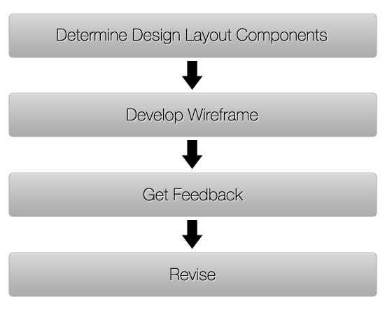
Developing a process for Web/Mobile/App design can organize your thoughts and speed up a project’s timeline. It’s a structured approach, a process that will take you from conception to completion. This development process is an outline of the steps, taken from start to finish, in order to complete a typical interactive design project. It divides and categorizes the project and then breaks sections into tasks and resources that can be used as a road map for each project.
PLANNING
The planning stage is where you create the “blue print” and map the direction for the entire project. This is the most important stage and usually requires client interaction and the accompanying attention to detail.
- Requirements analysis
This includes goals, target audience, detailed feature requests and as much relevant information as you can possibly gather. - Project charter
The project charter sums up the information that has been agreed upon in the requirement analysis. This a document that you create. It is concise and not overly technical, and serves as a reference throughout the project. It is everything that has been agreed upon. - Site map
A site map is similar to a blue print when building a house. Site maps guide end users need to find a piece of information. Go beyond simply listing pages when creating your map. Include links and a hierarchy of pages. - Contracts that define roles, copyright and financial points
This includes payment terms, project closure clauses, termination clauses, copyright ownership and timelines. The contract should be concise and efficient clearly spell out expectations and payments. - Gain access to servers and build folder structure
Gather needed information including FTP host, username and password; control panel log-in information. - Determine required software and resources (stock photography, fonts, etc.)
Determine any third-party media needs including photography, fonts, icons, etc.
Most designers will be given the site map which is usually created by an Information Architect (IA). This is a designer who specializes in Information Architecture, the art and science of organizing and labeling data for the Web, mobile and interactive designs.
Resource links for this phase:
- Jumpchart: Client/developer collaboration tool
- Dropbox: File-sharing and collaboration tool
- Mindmeister: Free online mind-mapping software
- Writing Bulletproof Web Design Contracts
DESIGN
In this stage you move the information outlined in the planning stage, into reality. A documented site structure and visual representation are the main deliverables.
- Wireframes
Using information gathered from the client and the site map, the design process begins with a layout called a wireframe. Pencil and paper are a start but there are also many online tools available. - Styleframes based on requirements analysis
Designing mock-ups in Photoshop to create PSD files that include the look and feel of the site is the next step. PSD files allow for easy modification, it keeps the design elements organized in layers, and can be handed off to coders for slicing and coding. In this phase you determine the colors, fonts, icons, photographs and other visual cues for the layout. - Review and approval cycle
The iterative design cycle of tweaking and approving the mock-ups takes place until everyone is satisfied with the design. The time to make changes is during the design phase, not after the design has been coded. - Slice and code valid XHTML/CSS
The design goes to coders who slice the final Photoshop mock-up, and write the HTML and CSS code for the basic design.
Resource links for this phase:
- Printable Sketch Templates for Wireframing
- Color Scheme Designer
- Type Tester, font comparison
- iPlotz, online template and wireframing tool
- Stripe Generator
- Favicon Generator
- Icon Finder
- Stock Exchange, free stock photos
Documentation – Files – Archives
Your work as the designer is now complete but documentation and storage are important final tasks. Establish a standard document format and folder structure for all of your projects and project files. Back up all files in multiple places.
Final resources:
- 6 Phases of the Website Design/Development Process
A great example of a Web design process broken into six steps. - Comparison of Web Design Workflow Processes
A detailed comparison of different types of processes. - Sample Web Design Process, With Advice
Step-by-step breakdown of a Web design process, with goals and best practices. - 50 Essential Web Apps for Freelancers
A great collection of Web applications to build into your process. - 3 Links to Websites Offering Free Document Templates
A great place to gather document templates for freelance business use. - Wiki of Web Design Resource Links and Code Snippets
Inspiration
Designing for Websites and iPhone/iPad Apps – First Steps
SITE MAP
Your projects site map is a document or design that is structured like a flow chart and built with software such as Visio or a free tool like Gliffy. It can also be as simple as creating an outline with bulleted lists and indentations that indicate pages and sub-pages.
Site Map Resources:
Mind Node – Free sit map creation tool.
WIREFRAME
Wireframe Your App – The first step in the design process. The wireframe focuses exclusively on the experience, ignoring the visual aspects (color, font, etc.). Wireframing helps clarify exactly what needs to be on the each page of a website or app. They are simple outlines of your app idea.
Benefits of Wireframing:
- Creating simple wireframes ensures that your designs will encompass all page elements that go into the design, and that they’re positioned in the best possible way.
- Wireframes are also cost-effective and can easily be revised or discarded, saving you time lost due to revising a high-fidelity comp.
- Like blueprints for a house, wireframes give your layouts a starting point and a solid foundation.
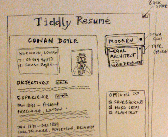
Below is an example of a wireframe for an app.

What to Include in a Wireframe
Your wireframes should include information that reflect what needs to appear on each page of your website or app. General elements of most web pages include: headers, footers, sidebars, and content areas.
Then add elements your specific project will have: dynamic widgets, basic site features such as search bars and navigation, graphics, etc.
Once you’ve completed your site map, start creating your wireframes based on those elements.
The depth of details depends on the project and the purpose of the wireframe. If it’s going to be used by more than one designer or developer, or presented to your client, then it needs to be more formal and more detailed. Don’t deliver a hand-drawn wireframe to a developer of client.
- An example of a low-fi wireframe for a web app. Image by Paul Downey.
High-fidelity (hi-fi) wireframes use certain design elements within the wireframe including the logo or some other basic graphics and other visual design elements. Some clients have a hard time visualizing what a website will look like based on a low-fi wireframe so ramping it up a notch adds another level or professionalism. Use Photoshop, Illustrator or other digital tools to create the high-fidelity wireframes.
The Wireframing Process
Sign off on the Site Map.
Hand draw the early iterations of the wireframes.
Sign off on the iterations and redesign using a digital tool.
- Image courtesy of Six Revision
Tools Commonly Used to Create Wireframes

- A sketch on gridded notebook. Image by John Manoogian III.
Pen and Paper
The most basic tools you can use. Graph paper works well, as it gives you clean boxes without having to use a ruler. Grid lines are also helpful in creating elements in proportion.
You can also add colored pens and pencils to differentiate between elements or to add more meaning by color-coding things. Your might use one color for a group of elements as it helps easily identify items within your wireframe as they’re moved around on different page layouts.
Web-Based Tools
Google’s Mockingbird (an app you download to use with Google Chrome)
Web-based wireframing tools include the ability to share wireframes with other team members or clients. They’re easily accessible from anywhere and being cross-platform compatible. Following are a few examples of browser-based wireframing tools:
CacooLumzyJumpchartBalsamiq MockupsGoogle Drawings
- Photoshop
- Illustrator (View tips on designing wireframes with Illustrator)
- InDesign (View tips on designing wireframes with Illustrator)
- Wireframe Sketcher
For this task, the tool doesn’t matter UNLESS your delivering the wireframes to a developer or client.

Image source: MOObileFrames
Resources:
The future of wireframing. (Good information in terms of how to make the wireframing process better for designers and developers.)
Free Web Wireframing Kits (Kit that includes a variety of UI elements, including buttons, breadcrumbs, dialog boxes, and more.)
Yahoo! Developer Network Design Stencils (Free UI stencils for a variety of applications, including OmniGraffle, Visio, Adobe Illustrator and Adobe Photoshop. The stencils include everything from grids to ad units to menus and buttons.)
Wireframe Symbols (This kit includes a variety of shapes and elements, like buttons, headings, lists, and tables, for creating wireframes in Adobe Illustrator.)
Sqetch (An Adobe Illustrator toolkit that includes a number of templates and elements, including iPad and browser chrome, GUI elements, and form elements.)
For reference: iPhone 5 specs
- Height: 4.87 inches (123.8 mm)
- Width: 2.31 inches (58.6 mm)
- Depth: 0.30 inch (7.6 mm)
- Weight: 3.95 ounces (112 grams)
“Making the simple complicated is commonplace; making the complicated simple, awesomely simple, that’s creativity.” —Charles Mingus
Designing for Touch Screens

- Courtesy of Net Magazine
The design of touchscreen interfaces will dictate the design and development of mouse user interfaces. The challenge is to create user experiences that work seamlessly across all platforms. Touch Screens are the future and will be the design base, then build out from there.
Great mobile designs do more than adhere into tiny screens: they accommodate for fingers and thumbs, making it a seamless experience. Visual and information design and industrial design go hand in hand when designing for mobile. It’s not just how your designs look, but how they feel in the hand.
Rule of Thumb
Designing for touch screen mobile phones means designing for the thumb. Thumbs have limited range and flexibility. Our thumbs can sweep the entire screen of most most phones, but the thumb naturally falls in an arc at the bottom left corner of the screen.
You’ll note that toolbars and navigation typically land at the bottom edge of phone interfaces. Desktop software conventions put menus at the top of the screen or window. Since our thumb span is limited, however, designers place the navigation and primary tap targets at the bottom.
- Courtesy of Net Magainze
Left vs Right: You’ll also note that touch screens favor neither left or right left-handed users as most people easily flip between left and right hands when using our phones.
Visual Hierarchy: The screen-bottom rule of thumb gives you hints about how to organise the visual hierarchy of tap targets. Place frequently used buttons at the bottom of the screen for easy tapping while being sure to place other controls out of harm’s way. in iOS, for example, the Edit buttons are at the top right, where you can easy view them but just enough out of reach to make accidental changes.
Bottom Navigation: More often than not, primary controls will noto be placed at the screen bottom. It’s not because of thumb comfort but for the simple fact that fingers obscure the screen. Keep content in clear view by positioning it above your app’s controls. It’s a common-sense layout that applies to most physical devices: iPods, calculators, cell phones, bathroom scales, etc. Content on top, controls on bottom.
Crowding the Interface: Take caution when designing for small screens. You’ll be tempted to crowd the interface because you need to add one more button or icon by nudging all the buttons or icons just a little closer. Don’t do it! You’ll lose the intuitive flow of the design and crowd the screen. If you HAVE TO squeeze buttons close together, those buttons should be bigger. The minimum size for button design is 44×44.
RESOURCES:
Read more about android, tablet and designing for touch screens at New Magazine and User Interface design for the Iphone. Also take a look at 10 Beautiful iPhone App User Interfaces
Always save your native files as a PSD file. Never, never, never delete that file!
When uploading an image to your blog, Flickr or any other web or mobile device, the image needs to be resized for that specific purpose. Photoshop 6.0 includes a “Save for Web” command allowing you to produce a copy of your image that is optimised for Web use. The image file will be as small as possible, sized correctly and will use only Web-safe colors. Save for Web can produce GIF, JPEG, or PNG format images.
You tell Photoshop how you’d like to optimise your image for the Web. You select the file format to produce (GIF, JPEG or PNG), what size palette you’ want to use, how to cut down the colours to fit the chosen palette size, and how much to sacrifice image quality to produce a smaller file size.
Presets
There are a lot of options in the Save for Web dialog and there are a list of presets you can choose from. Click the Settings: drop-down list (just below the Cancel button) to bring up the list of presets. There are three basic image formats in the presets – GIF, JPEG and PNG. As a basic rule, use JPEG’s for photos and GIF’s for everything else. For a full tutorial on choosing the right image format, see Understanding image formats.
Optimizing GIFs
If you’re making a GIF, start off with a preset such as GIF 32 Dithered, which should work well for most GIFs. You can then fine-tune the optimisation to suit your needs. Some of the important optimisation options are discussed below.
Transparency
This checkbox is only available if your image does not have its Background layer turned on. It specifies that you want parts of the saved GIF to be transparent. If you deselect this checkbox, the transparent areas will instead be filled with the Matte color (or white if no matte is selected).
Interlaced
This checkbox controls GIF Interlacing. If enabled, the GIF will appear gradually as interlaced horizontal lines as it is loaded on the Web page, which gives viewers something to look at while the full image appears.
Lossy
This slider allows you to remove some detail from the image, in order to reduce the file size further. Use only if you don’t mind reducing the image quality quite severely! A value of 0 will not remove any detail; a value of 100 will remove the maximum amount of detail.
Colors
This is where you choose the size of your GIF palette. A palette of 32 colours is often sufficient for web images, but if your image has a lot of detail and looks too fuzzy/blurry/banded with 32, up it to 64, 128 or 256. If your image has very few colours in to start with, or doesn’t look too bad with fewer colours, select 16, 8, 4 or even 2! This will make the GIF file size smaller.
Note: Do not attempt to upload a PSD file to the web. PSD files are native to Photoshop and will not display on the web. Images for the Web should be sized at 72dpi, RGB color mode and the exact pixel size that you want it to appear on the Web.
Slicing the PSD – Build a Sleek, Dark Mobile App Website
IF WE DON’T GET TO THIS IS CLASS – DO THIS FOR HOMEWORK:
Open Adobe Photoshop. You can get the full PSD file and a tutorial on how to design it over at Webdesigntuts+. To create our slices, we will be using the Slice Tool (Keyboard shortcut: C). These slices will be saved within the PSD and will make it much easier to update the images of our site later on.
After each slice we create, we’ll be using the Save for Web & Devices feature of Photoshop (accessible through the “File” menu) in order to save each individual slice into the images/ folder we created in
Options for each individual slice can be defined through the small checklists below each slice instruction. To assign the slice a name, you’ll need to double click on the slice in the Save for Web & Devices.
Background Texture
 The first slice will be for the textured background. This slice is a bit tricky given it’s a pattern and can often look choppy or uneven if sliced incorrectly.
First, open the layers panel in Photoshop and hide all the layers except for the layer entitled Background. Then, grab the Slice Tool (C) and create a 200x200px slice starting from the absolute top left corner of the document as seen on the left.
Name this slice: texture. Save as a JPEG at 80% quality.
Spotlight
 The spotlight graphic is the next asset we’re going to tackle. For graphics like this, where it’s difficult to tell where exactly the edges are, it’s a good idea to find the layer in the layers panel, Right-click the layer thumbnail and click Select Pixels. This will give you an outline telling you exactly where the layers edges are.
Now, you can trace this outline.
Name this slice: spotlight. Save as a JPEG at 80% quality.
iPhones
 For our iPhones, we’ll need to unhide the folder named iPhones. Once these are visible again, create a slice that encompasses both phones keeping the slice as close as possible to the edges of the phones. You should end up with a slice with the size of around 420x625px.
Before saving, hide the Background and Spotlight layers in the Layers panel (this will create a transparent background).
Name this slice: iphones. Save as a PNG-24.
Logo
 Next up is our logo. Unhide the folder App Description, create a slice around the logo that measures 315x80px in size. Try and get as close to the logo edges as possible. Using the Zoom Tool (Z) helps for this step.
Before saving, hide the Background and Spotlight layers in the Layers panel.
Name this slice: logo. Save as a PNG-24.
App Store Button
 For the app store button, unhide the folder Download Button, then right-click the folder and select Duplicate Group. Under the destination select New and click OK. This should open a new document with a copy of the download button. Duplicate this group once again, this time, don’t change the destination.
Apply an Outer Glow effect to the “Button” layer in the duplicated group with the settings: 22% Opacity, #FFFFFF, and 13px Size. Move this duplicated group 30px under the original.
Finally, select Image > Trim… and click Transparent Pixels then select all the check boxes under Trim Away and click OK. We should end up with an image that looks like this (known as a “sprite”):
Save this as a PNG named app_store.png into the images/ folder.
Horizontal Separator
 The horizontal separator is the 2px line that appears under the iPhone’s description and above the footer. Unhide the Line Bottom and Line Top layers and zoom into the top lines (below the iPhones) at about 700% and draw a 1x2px slice.
Before saving, hide the Background and Spotlight layers in the Layers panel.
Name this slice: h_separator. Save as a PNG-24.
Screenshots
 For the screenshots, we’re going to create four equal slices of 185x130px around each screenshot.
Before saving, hide the Background and Spotlight layers in the Layers panel.
Give these slices relevant names. Save them as PNG-24.
Bullets
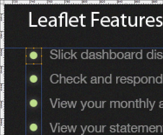 Since all the bullets are the same, we only need to slice out the first one. Zooming in to around 400%, create an 18x18px slice around the bullet, this size should account for the “glow” effect that has been applied to them. If you realize the bullet is not centered within the slice, feel free to move the slice around by dragging it with your mouse or using the arrow keys.
Before saving, hide the Background and Spotlight layers in the Layers panel.
Name this slice: bullet. Save as a PNG-24.
Footer Icons
 To slice the icons used in the footer area, we’re going to repeat the steps we did when creating a sprite for the App Store Button.
Start by selecting the four footer icon layers in the Layers Panel (The layers are named: Twitter, Help, Download, Copyright and located in the “Footer” folder).
Then, select Layer > Duplicate Layers. and under the destination select New and click OK. On this new layer, you may notice the icons are nearly invisible, so, it helps to create a blank layer, position it to the bottom of all the icon layers and use the Paint Bucket Tool (G) to fill it with a solid color (I chose #000000).
Next, we need to arrange the icons directly under one another (no spaces), to form a vertical line like so:
Save this as a PNG named icons.png into the images/ folder.
Homework | Week 3
- In your del.icio.us account tag three Web Sites that focus on web design site maps, web design wire frames, web design style frames, slicing Photoshop files or anything we learned in class today, and write a note in the Delicious comments section about why you think each one would be a good resource for this class.
*Make sure you also add the tag:
msuinteractivemedia
AS WELL AS add additional tags.
- Complete the Slicing the PSD – Build a Sleek, Dark Mobile App Website tutorial. Upload each INDIVIDUAL slice is the exact proportions described in the tutorial to your WordPress blog and to you Flickr feed. *Make sure you also add the tag: msuinteractivemedia on your Flickr account.
- Open the PSD file of the website mockup you did for week 2’s homework and create a WIRE FRAME. You are free to choose which program you want to use. Save it as a .jpg and upload to your class blog and your Flickr feed. *Make sure you also add the tag: msuinteractivemedia on your Flickr account.
- Resume.html continued. Revise your resume to include the following:
This final resume project will be graded as a quiz grade and is worth 50 points. It requires you to use both HTML5 and CSS. That means you will have a page called resume.html and a page called style.css.
The required contents for this resume are:
- Name
- E-mail address
- Education
- Work experience
- Skills
- Three or more professional goals
- Bio
- Artist Statement
HTML/CSS requirement:
- Your HTML page must have a title
- Meta data inside your head tag
- Properly nested tags
- Use at least two of the three different list types
- Link to style.css
- Use at least five different tags which could include the following tags: bold, italic, space, break, header, horizontal rule
- Use at minimum two different links – one of which must be the email link and the second links to and external website. You may use more than two.
- Insert at least one image
- Must include a list that is your main navigation which links to the pages: index.html, contact.html and homework.html.
- Validate your code
- Background-color
- In CSS, add fonts, colors and other attributes
You may add additional material, as well as relevant images.
Your resume page should be visually impressive, structurally sound and it should be well-ordered and organized.
This project is worth 50 points that break down as follows:
- Communication & Content: all of the required resume information is present and laid out in a manner that is easily understood. All content is useful and gives the reader a basic understanding at first glance of who you are and what you are trying to communicate.
- Technique & Design: the HTML5 & CSS are coded correctly and there is evidence that usability was considered and implemented in your design. The design should present you and your accomplishments in the way you want to be represented.
- Overall success & strength of the project
- Your code is validated and free of errors.
- Code Academy: Complete exercises 1 through 3. Lesson 4 & 5 are for extra credit and an additional 10 points. Lesson 6 is also for extra credit and gives you and additional 10 points. Total extra credit: 20points possible!
- Each week when you comment on the class blog, leave me a link to your WordPress site, your Delicious site, your Flickr site and your MSU Web hosting space. Check your links and make sure they work!

Recent Comments